How to Redesign a Charter School’s Website
What happens when you combine a hand-coded website from early 2010s with the needs of a modern and ever-growing student body? Enter Guardian Charter School (name has been changed). Guardian Charter School’s website was faced with many issues. The website was hand-coded using HTML, CSS, and JavaScript with no CMS support. The layout looked like something from early 2010, and the mobile experience was literally non-existent. The client asked if I could do a site redesign. What I ended up doing was building the site from the ground up on WordPress, but I’m getting ahead of myself …
It all started back in the Fall of 2020 when I was approached by my neighbor regarding updating their charter school website. The site was originally created back in the early 2010s and was being met with complaints from parents, faculty, and students as well as not being up to code according to government policies. The site was difficult to navigate and hadn’t been updated since it was first built. Additionally, the site was hand-coded so any attempts at using the website would be to either update the code or start from a blank canvas.
Primary Site Analysis:
I began working on the site by conducting a primary site analysis. At this point, I wasn’t yet committed to taking on the work. Therefore, I gave an honest analysis of the strengths and weaknesses found on the various pages. Some of the insights gained are listed below.
Home Page:

The school fee section didn’t go into details and linked to a different page. I suggested replacing the text with a slider that took users to a page breaking down the cost. The goal was to minimize the number of clicks and get to the most important areas of the site. If a user had to click on multiple links, they were less likely to find the information sought and to give up. It would be easier to highlight information on a Home page slider so users to easily access information, pay school fees, etc.
School Policies and Procedures Page:

The page felt overwhelming. It was difficult to determine the areas of emphasis. Some topics seemed unnecessary, such as the asbestos’ link. Unless it was legally required information, it would better serve the website to remove the link. The same goes with other polices and procedures. If they aren’t required and add little value, why not just get rid of them?
Project Brief:
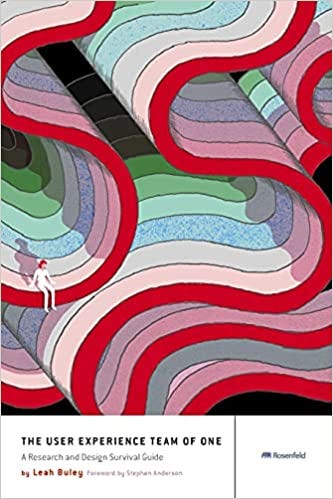
Once I provided the primary analysis, the school decided they wanted to hire me for a complete redesign. Since this was the first website I had ever built from scratch, I was unsure of the steps to take. Luckily, I was reading The User Experience Team of One: A Research and Design Survival Guide. This book provided me with a useful layout for establishing project milestones and goals to complete the work.
I came up with a project brief timeline to help me stay on track as seen below:
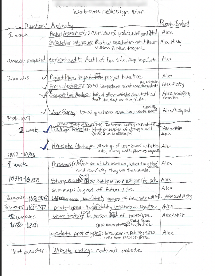
Although I planned on using all of the steps, I ended up focusing on the following:
• Competitor Analysis
• Information Architecture Map
• Sketches and Wire Frames
• Surface Comps/Prototypes
Competitor Analysis:
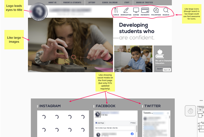
The first step was analyzing competitor websites. This consisted of looking at other charter schools to see their layout patterns. This was done for two reasons.
First, Jakob’s Law: “Users spend most of their time on other sites. This means that users prefer your site to work the same way as all the other sites they already know.”
Second, I wanted to know the basics of what the competition was doing so I could highlight what worked and avoid areas where they struggled.
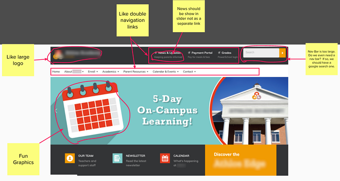
Some of the major takeaways from the project were using large icons to access various assets as well as using the Home page as a marketing tool to attract potential students/parents into enrolling.
Information Architecture Map:
After talking with the stakeholder, it was determined that there needed to be certain pages created. The Information Architecture Map provided a high-level overview of what pages were necessary and how much nesting should occur. Rather than recreate the old site, I determined to only include those pages that were necessary. This worked to reduce load time along with establishing what users could accomplish on the site. The following image highlights the main structure of the site:

Sketches and Wire Frames:
After determining the site architecture, I created wire frames based on layouts from other sites as well as applications to meet our own needs. The wire frames provided a basic layout of what I was hoping to accomplish with the site.


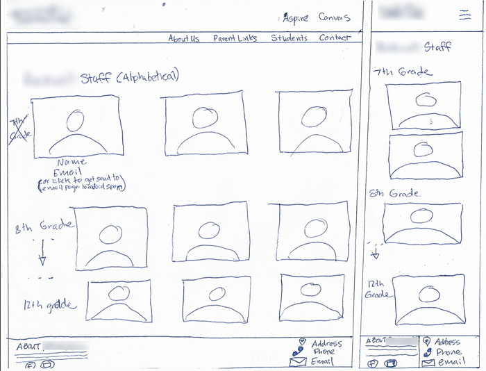


Surface Comps:
Once I had created the wire frames, I decided to design everything in Sketch for prototyping. Unfortunately, my computer crashed during this period, corrupting the Sketch file, and making it impossible to go back to access it via the Time Machine.

This taught me an important lesson. Always back up your data to at least three different sources. Also, be sure to export your data to another format (PDF, PNG, etc.), so you can see it when you need it.
Prototypes/WordPress Building:
After the stakeholder looked over the surface comps, they were so pleased that we skipped creating prototypes using InVision. Instead, we began working on getting the back-end ready so we could upload the WordPress files to create the site. This involved setting up the website on GoDaddy, modifying the DNS records, installing WordPress and determining the most user-friendly theme to work with (Ed School Theme), because it had a lot of the components already built out, which required less hand-coding.
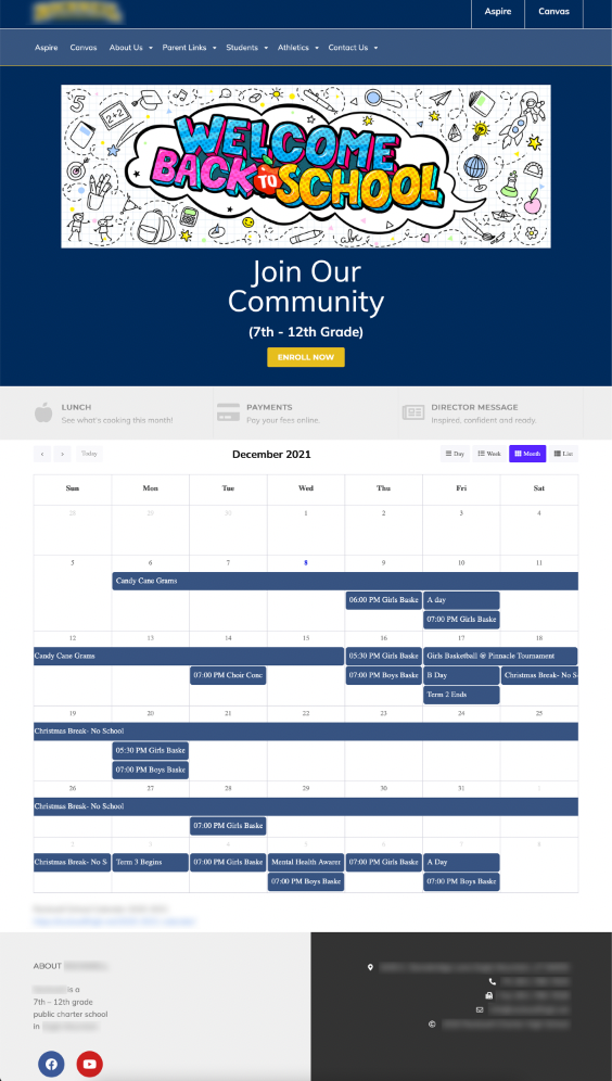
One major issue I ran into was how to put a calendar on the Home page. There are many different calendar apps, but the stakeholder wanted one that would sync with their Google Calendar. All the really good calendars provided a way to link up to Google Calendar, but you had to pay for these settings. Up until a couple of months ago, we relied on a poorly executed default calendar that didn’t connect to the school’s Google account. However, after lots of research and plug-in testing, I was able to find a calendar that linked to Google Calendar and looked professional.
Final Layout:
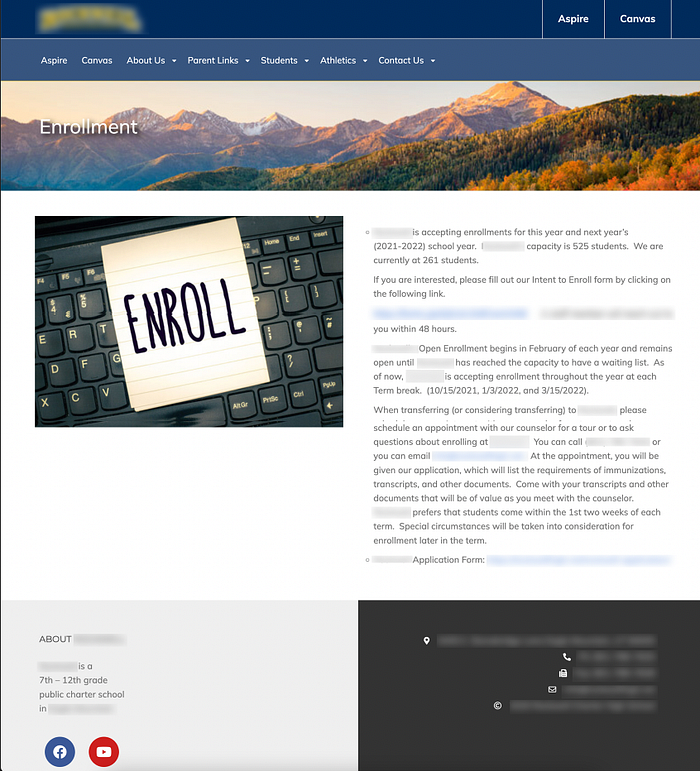
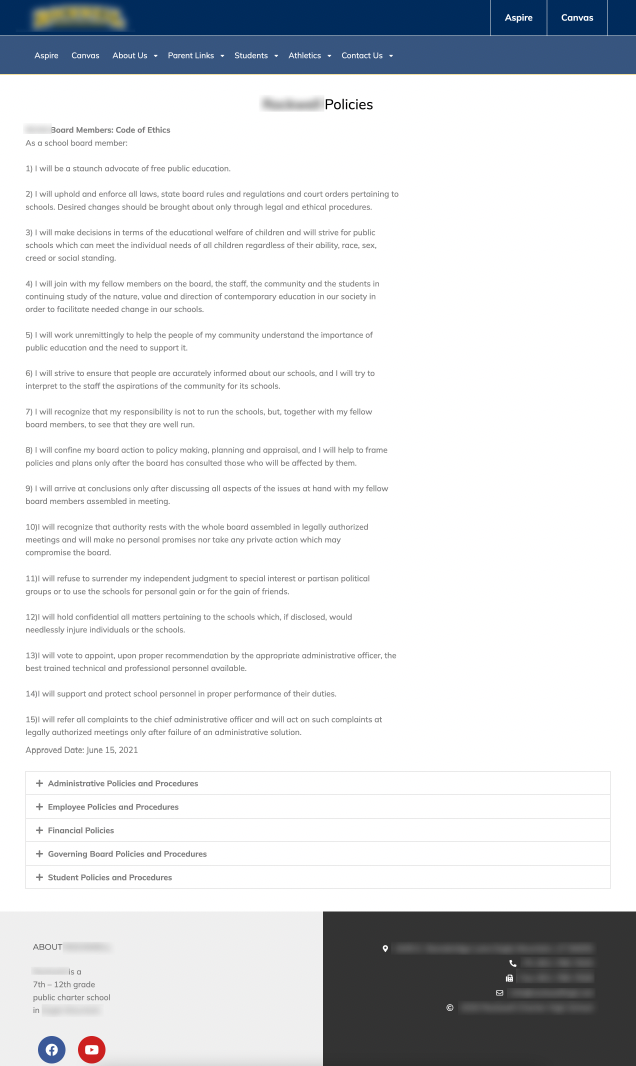
The final layout of the project came together really well. The stakeholders were pleased. I was later informed that one parent decided to send their student to the school, because they were so impressed by the website!
Closing Remarks:
The product is continually evolving and developing. Most recently I had to update the list of policies and procedures on the site to meet with government compliance.
Looking back at the project from where it is was to now, I am satisfied with the results. The site looks professional, works well, and provides students access to Aspire and Canvas while also keeping parents, faculty, and staff
up-to-date on what’s going on in the school.
If I had to restart the process from the beginning, I would have come up with a UX Project Brief much earlier. As it was, the project took much longer to get up and off the ground, because I didn’t have a set way of going about the process. Additionally, the hardest part of the project came from not having a mentor to discuss the project with, which is where The User Team of One really came in handy. It provided clear, usable steps and discussions of what needed to be implemented including user testing.
Some other aspects that I learned included that I never want to code again
… ever. I know how to code and play with CSS properties, but this was my least favorite part of the project. Coding becomes really nit-picky and requires cross-platform support. Additionally, WordPress makes updating content a lot easier with their building block software, Elementor. It also requires little code, so you can concentrate more on the visual aspect of things.
Lastly, I also learned a lot about project management, working with clients/stakeholders, and keeping to a deadline. It took three to
four months overall from initial analysis to final product. If I was to build another website, I would be able to shave some of that time off especially with The User Team of One on my side.
Alex Strasburg is a student in the Digital Media program at Utah Valley University, Orem Utah, studying Interaction & Design. The following article relates to (Internship) in the (DGM 281R Course) and representative of the skills learned.